
This Probiotic Soda Packaging Design case study showcases how premium beverage branding can transform a functional drink into a shelf-ready product.
In today’s competitive beverage industry, packaging is everything. Consumers decide within seconds whether a product feels premium, trustworthy, and worth trying. For COVE, the goal was simple: Create a bold, modern, and shelf-dominating beverage packaging design system for a probiotic soda and kombucha brand that feels premium, clean, and instantly recognizable.
Project Overview
This packaging design project focused on building a scalable and visually striking can design system for a modern wellness beverage brand. The challenge was to create packaging that feels:
- Premium
- Modern
- Easy to recognize on shelves
- Health-conscious
- Scalable across multiple flavors
- Perfect for ecommerce and retail
The final result is a clean but powerful packaging identity that instantly communicates flavor, wellness, and premium quality.
The Packaging Design Challenge
The functional beverage market has become extremely competitive. Most probiotic drinks and kombucha packaging either:
- Looks overly clinical
- Feels visually cluttered
- Lacks shelf visibility
- Fails to communicate flavor quickly
The challenge was to create a premium beverage packaging design that immediately stands out while still maintaining a clean wellness aesthetic.
The packaging needed to:
- Create instant shelf impact
- Build consumer trust quickly
- Clearly communicate the product category
- Show flavor recognition immediately
- Look modern and premium
- Work for future product expansion
Packaging Design Strategy
To make this beverage packaging design successful, we focused on four key principles:
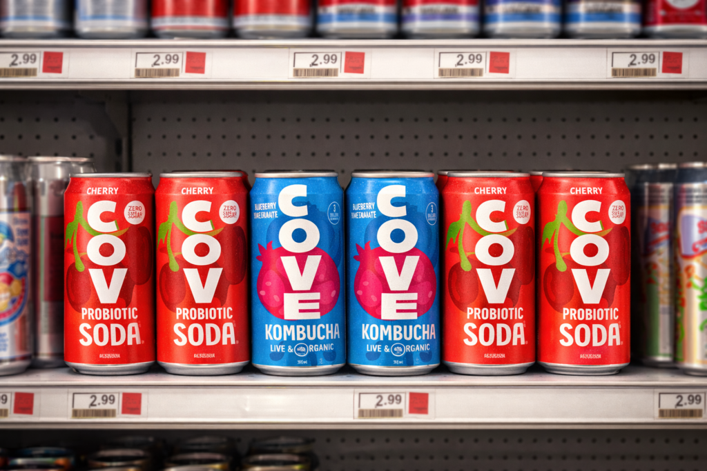
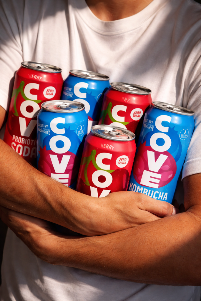
1. Shelf Visibility First
In retail environments, consumers make decisions in seconds. Large typography was intentionally used to maximize visibility from a distance and improve brand recognition.
The oversized vertical logo system helps the cans stand out instantly on crowded shelves.
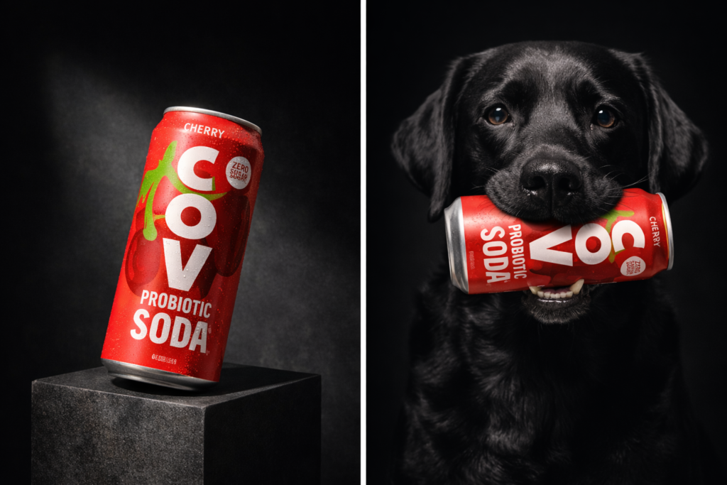
2. Premium Simplicity
Instead of overwhelming the packaging with unnecessary graphics, the design follows a clean premium approach.
Minimal layout + bold typography = strong premium positioning.
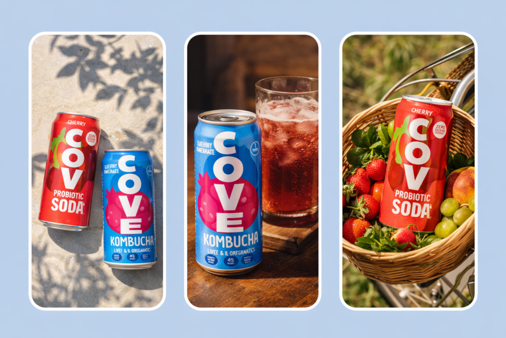
3. Flavor Recognition
Consumers should understand the flavor instantly. Large fruit illustrations help communicate taste quickly while maintaining visual consistency across SKUs.
4. Scalable Brand System
The visual identity was designed as a packaging system — meaning future flavors can be launched without redesigning the entire brand.
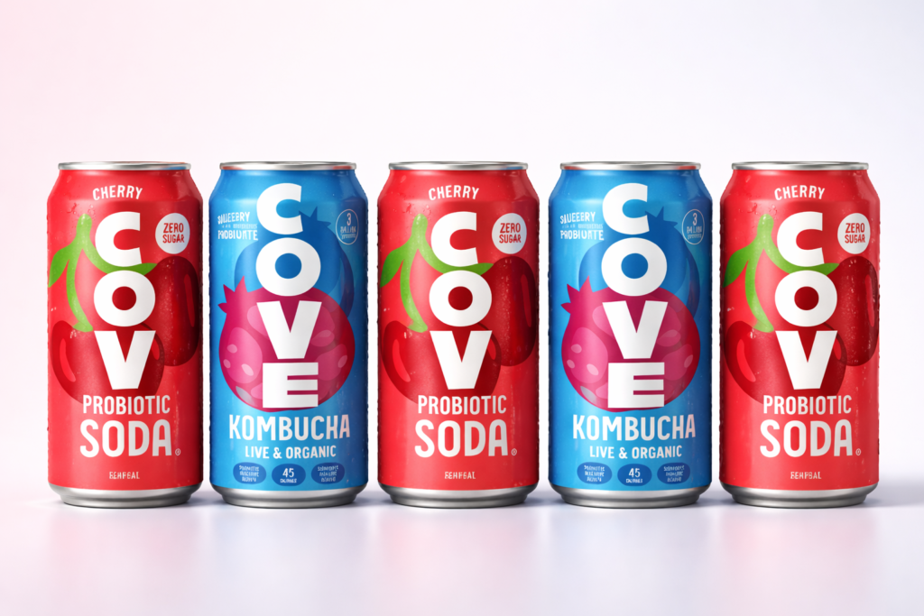
Bold Typography for Maximum Shelf Impact
One of the strongest visual elements in this project is the typography.
The oversized vertical type creates:
- Instant recognition
- High shelf visibility
- Strong brand memory
- Modern premium aesthetics
Instead of relying on busy visuals, the typography itself becomes the hero element of the packaging.
This design strategy is commonly used by successful premium beverage brands because it improves both readability and shelf dominance.
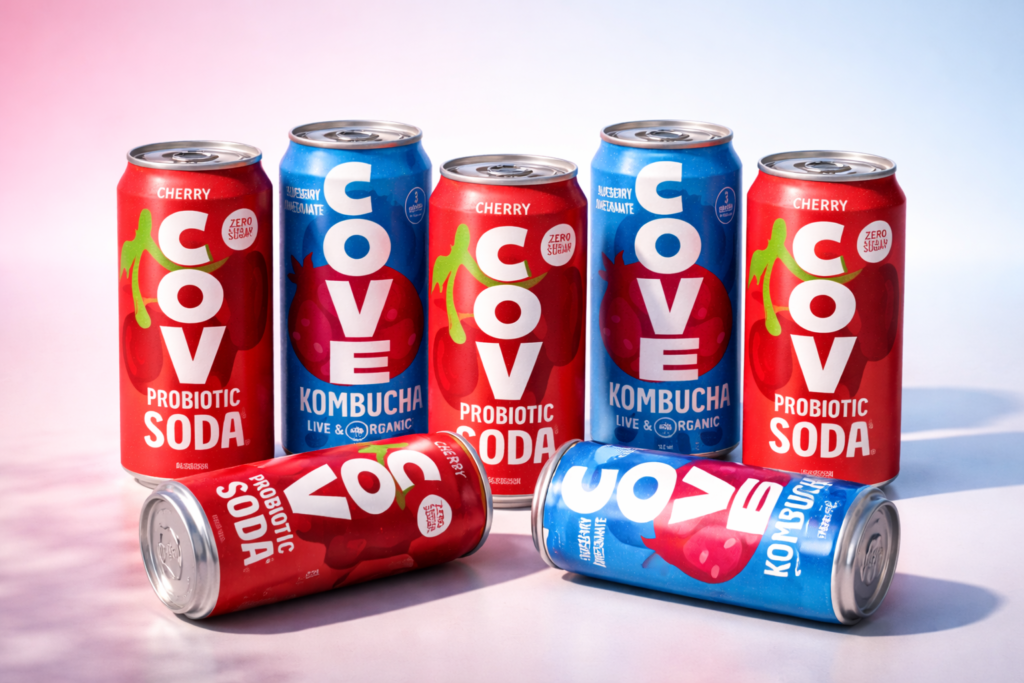
Flavor-Based Packaging Color System
Each beverage variant uses a strong but premium color palette to help customers quickly identify flavors.
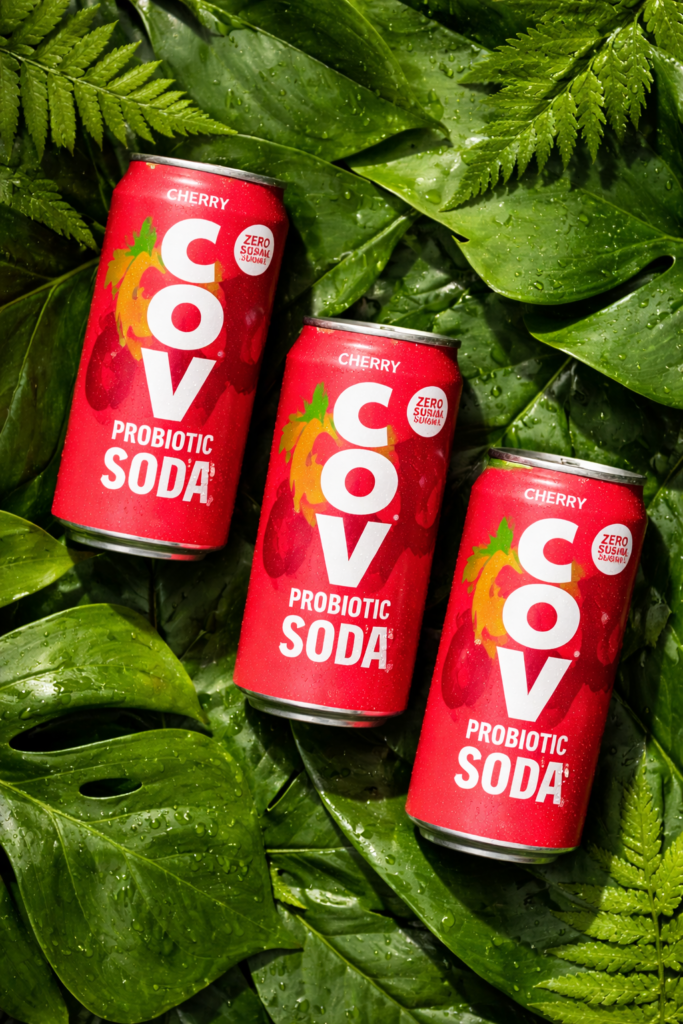
Cherry Probiotic Soda
The cherry variant uses bold red tones to create:
- Energy
- Flavor excitement
- Strong shelf impact
- High appetite appeal
Blueberry Kombucha
The blueberry kombucha flavor uses vibrant blue tones to communicate:
- Freshness
- Hydration
- Wellness
- Organic positioning
This strategic use of color helps consumers instantly differentiate flavors while maintaining overall brand consistency.
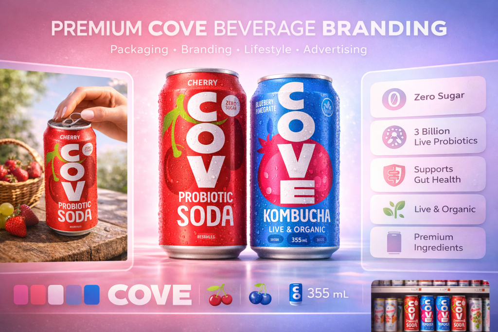
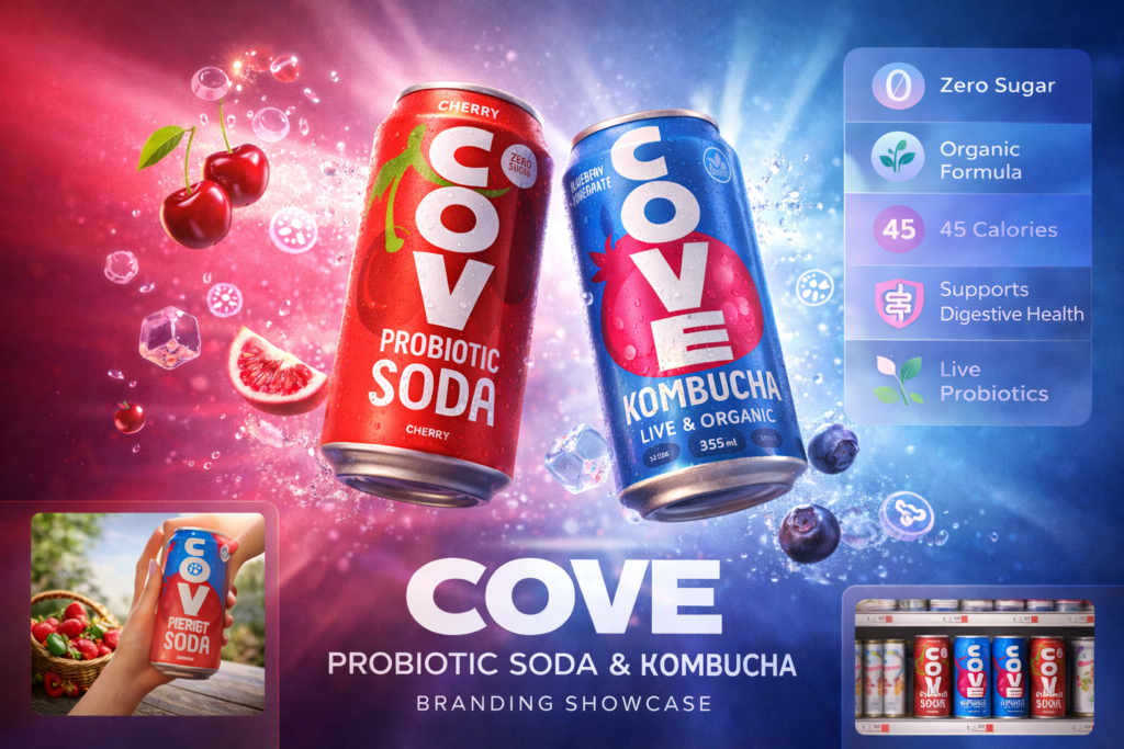
Wellness Meets Modern Beverage Branding
The packaging communicates health benefits without becoming overly medical or clinical.
Important product messages such as:
- Probiotic Soda
- Kombucha
- Zero Sugar
- Live & Organic
are displayed clearly to improve customer understanding and product trust.
This approach helps position the product as a modern wellness beverage that feels approachable, premium, and easy to understand.
Why This Beverage Packaging Design Works
Successful beverage packaging must do more than look good. It needs to sell.
This packaging works because it combines:
- Strong typography hierarchy
- Instant flavor communication
- Clean premium branding
- Modern wellness positioning
- High shelf visibility
- Scalable product system
The result is packaging that feels premium while still remaining fun, modern, and highly approachable.
Final Packaging Design Outcome
The final COVE beverage packaging system successfully balances:
Shelf Impact + Brand Recognition + Wellness Positioning
The packaging feels premium enough for retail shelves while remaining modern and highly optimized for ecommerce product presentation.
Its scalable design system allows future flavors to launch quickly while maintaining a strong and recognizable brand identity.
Need Premium Beverage Packaging Design?
Your packaging has only a few seconds to build trust.
Whether you sell:
- Energy Drinks
- Functional Beverages
- Probiotic Soda
- Kombucha
- Hydration Drinks
- Wellness Products
- Supplements
premium packaging design can dramatically improve shelf visibility and customer trust.
I help brands create:
- Premium Packaging Design
- Beverage Label Design
- Supplement Packaging
- Amazon Packaging Design
- Retail Packaging Systems
- 3D Product Mockups
Let’s build packaging that customers instantly remember.